The trend of flat web design has emerged in the last few years. In no time, this combination of exotic typography and bright colors with unique flat interfaces has exploded in popularity. As a brilliant design concept, flat web design puts its focus on the content, emphasizing usability.

It leverages user-friendly features like open space, bright colors, clean interface and 2D illustrations. The credit behind the popularity of this flat design trend, however, goes to large companies like Microsoft and Apple for changing their design aesthetic and implementing the flat design style on their interfaces. In fact, Microsoft was the first company to adopt flat design as early as in 2006 in their Zune mp3 player, which included flat design elements.
Later in 2010, Microsoft released their Windows Phone 7 built on the elements of flat design. And gradually, the company moved its current products including its website, the Microsoft Office, Windows 8 and Xbox 360 to flat design language. Soon after that Apple followed the example and released iOS 7 that featured flat UI (user interface) design elements.
- Flat design: More than a trend
- 5 key principles of flat design
- Where and when to use flat design
- Flat design pet peeves
Flat design: More than a trend
Considering the examples of Microsoft and Apple, it is obvious that flat design is not really a recent trend that suddenly popped up, but one from years past. However, it seems to be making a greater impact recently and is expected to be in style in the coming years as well.

Flat design came into existence as designers were trying to move away from skeuomorphic designs, which focused on design elements to recreate real life to the UI. Using advanced design tools and online design software, designers leveraged skeuomorphism to create more compelling graphics and design elements than before. Yet, the issue with skeuomorphic designs that aimed to recreate real life elements onto UI is that they become useless and unappealing once you see them on screen.
However, the debate of skeuomorphism vs. flat design is basically a silly status quo just like those of Yahoo vs. Google and iOS vs. Android. Many designers now believe that the future of flat design will end up in a combination of flat and skeuomorphic designs, but that’s a different topic altogether.
5 Key principles of flat web design
Despite the fact, that flat web design is more than a trend now, not a lot of designers are following its basic design principles. When you are working with a flat website, you need to consider the below principles to provide a great user experience regarding several aspects of the site.
1. Minimalistic design
Websites in flat design are known for their simplistic, clean and minimal design. The first design principle is therefore to keep the visual appearance minimalistic. This is the biggest difference it has with skeuomorphic design, which is characterized by attractive UI elements, animations and 3D effects. With flat design, there is no such embellishment; instead simple UI elements and vivid color patterns are used to create an impressive UI design.
2. Simple UI
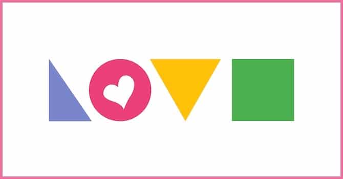
Designers have plenty of simple shapes in their arsenal such as circles, rectangles, and squares to integrate various UI elements when it comes to flat design. They can use any shape to create the best UI pattern as long as the flow of actions is consistent. This is done to ensure a smooth performance.
3. Typography & colors
In addition, flat design includes vivid colors and exciting typography to create a compelling interface. Drop shadows, gradients and other strong design elements, although interesting, are not supported by the principles of flat design. It rather favors bold and vibrant color palettes. Designers use brighter color schemes, which is not something you usually will find in skeuomorphic designs.

Again, the typography of a flat website adds a special tone to the design. Since content is the core element of this design, designers are allowed to use various typefaces in order to enhance the overall look by means of the best suitable font.
4. No depth
Flat design, with its 2D illustrations, marks the end of the depth web design era. With the absence of strong UI elements like strokes and drop shadows, designers of this trend can now simplify images and objects to create appealing and state-of-the-art real world visual effects.
5. Presence of visual hierarchy
Visual hierarchy is a must have characteristic of flat design as there is no distinction between different UI elements, thanks to the lack of gradients and shadows. One issue with the lack of such UI elements is that users find it difficult to click their preferred element.

And this also is the reason why designers create a visual hierarchy by means of different font sizes and color schemes, distinguishing the clickable items from the rest of the page. So the real challenge of flat design lies in capturing the design aesthetic. The designers can, however easily overcome such challenges by simply following the proper path / principles of this design trend.
Where and when to use flat design
Although it is simple to create, flat web design is not recommended for all websites. Rather, keep it for portfolio and tech websites. If you want to create websites for kids, entertainment or gaming websites, flat might not always be the ideal option. For these sites, you need something that allows you to add fun elements, attractive graphics and UI elements, which aren’t typical of flat design.
You should therefore keep your target audience in mind when designing a website. Consider the usability behind the design, not just the aesthetics. Do the minimalistic elements you are using on the page serve any purpose? If not, it is likely to confuse your users.
Flat design pet peeves
Those who are not fond of flat design say, that it is just a whim that will pass in time while many others think it is just the next step in the world of design evolution. But as mentioned, flat design is not a trend that will fade away with time; it has been there for quite long and is here to stay. That said, there are certain pet peeves with the flat trend.

The extreme minimalism and the Swiss-style design philosophy can make your website look featureless. That is also a reason why it is essential to remember that creativity may seem lacking with ultra-minimalist designs.
Another pet peeves is the designers’ fear of breaking from the industry standards. Since everyone is talking about flat design lately, you too need to keep up with web standards. Really! What if your website is still a failure because it lacks creativity and users find it confusing?
Conclusion: Things to consider when using flat design
Flat design, just like any other design language or trend, has a purpose – usability. Before you jump on the flat design gold rush, ask yourself do you really need it. We already have a lot of generically designed websites just because designers are afraid to do something different than the norm. Yes, flat design is in style now, but you need to consider if your users truly need it. Will they really be happy with flat design? If not, dare to be different. What do you think? Let us know in the comments.